top of page

Create Your First Project
Start adding your projects to your portfolio. Click on "Manage Projects" to get started
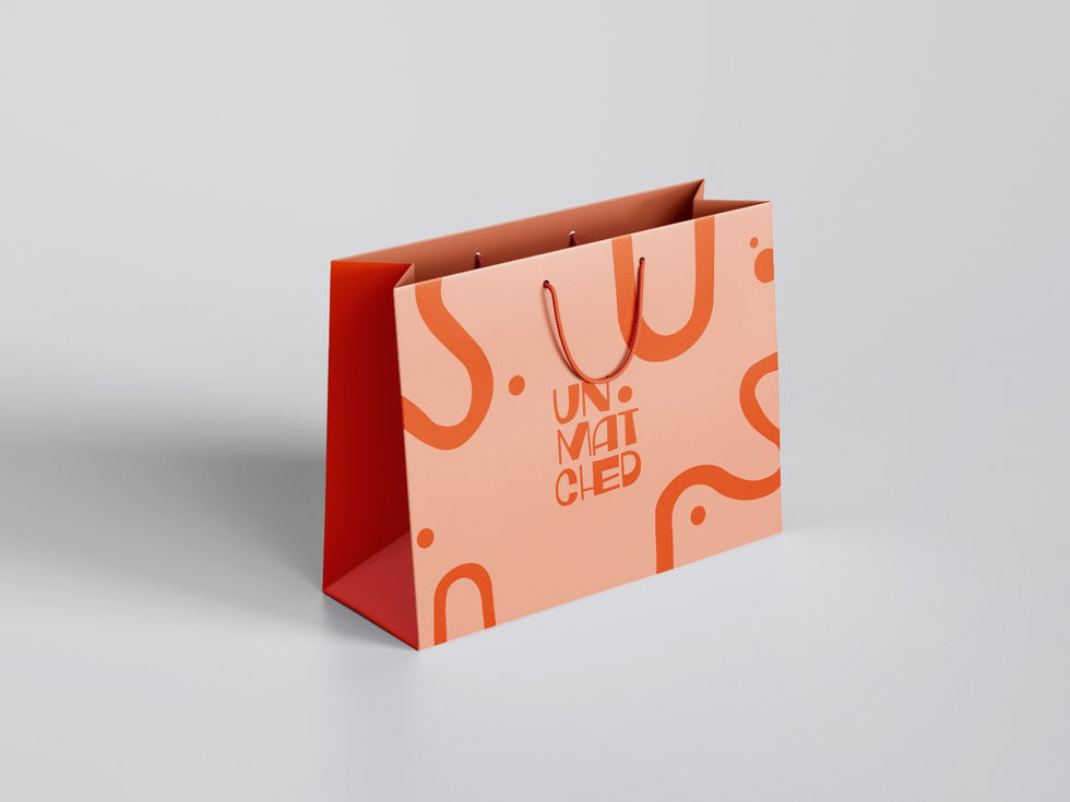
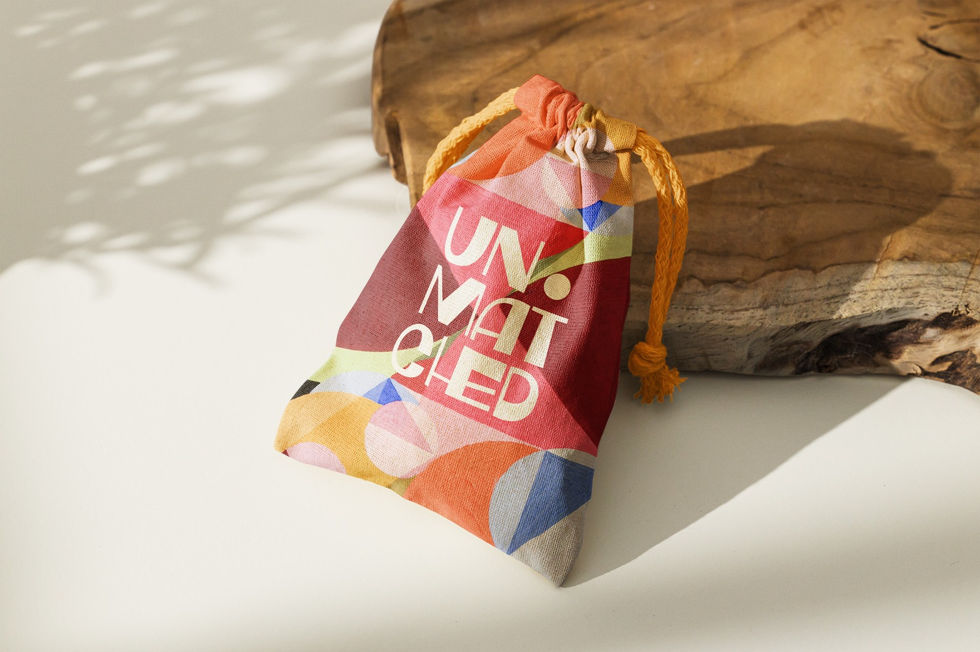
Unmatched
Tipo de proyecto
Branding
Fecha
Enero de 2024
Ubicación
Madrid
The logo merges minimalism and abstraction to represent identity and creativity. Varying line thicknesses symbolize diversity, while their structure reinforces unity within uniqueness.
The symbol, derived from the brand’s initial, enhances recognition and suggests dynamism. The dot above the “U” adds a distinctive touch, ensuring a clear and memorable visual identity.


bottom of page

